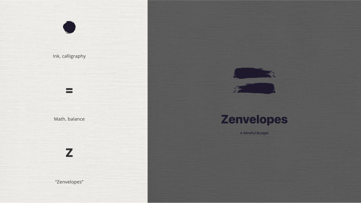
Zenvelopes
Project overview
The objective was to design a native budgeting app for iOS and Android. I assessed the user and competitor context via a research phase, which helped identify unique opportunities for a new product. Finding that a growing demographic of independent professionals experience increasingly complex budgets and budget anxiety, I proposed a solution inspired by Kakeibo, an ancient Japanese method. A unique feature asks users to distribute each expense and savings goal into one of four categories: wants, needs, culture, or the unexpected. The outcome is a mindful budgeting app that helps users plan, track, and reflect on their financial decisions so they can grow a healthy relationship with money over time.
Try a prototype
Both prototypes open in Figma. Choose iOS or Android to see design to native platform guidelines.
Define the problem
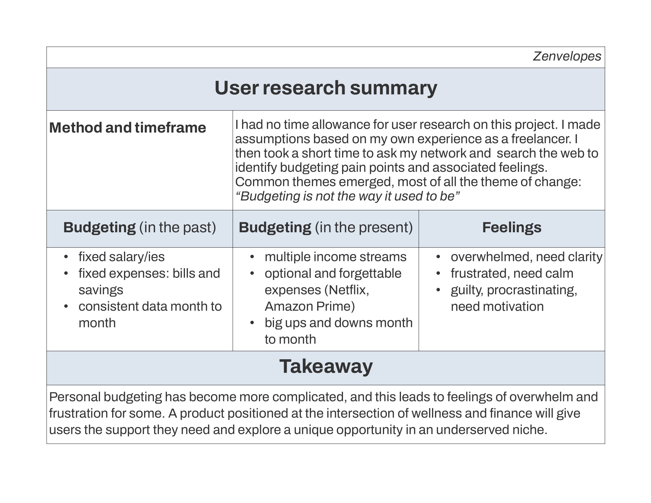
We live at a time of change: more individuals shift to freelance work each year, and even full-time employees are finding ways to monetize their passions. The freedom of this can feel amazing, but it comes at the cost of complicating our monthly budget. Gone are the days of the simple household ledger showing a fixed salary and a number of regular bills! Increasingly we need to manage multiple income streams, big changes month to month, optional expenses and more. What tools exist to help meet this new challenge, and who is most affected?
Key target users
The app's target audience includes makers, nomads, side-hustlers, social media creators, and freelancers. Anyone with unpredictable or sometimes negative income, such as a student. They may experience financial anxiety, may describe themselves as “not a math person”, and struggle with tradional budgeting methods.
Key competitors
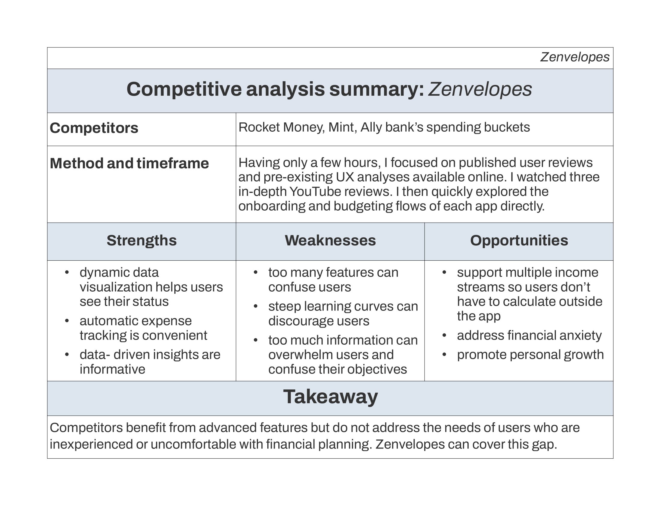
I explored Rocket Money, Mint, and the Spending Buckets feature offered by Ally Bank.
I found that while they offer powerful features like dynamic data visualization, automatic expense tracking, alerts, and insights, they suffer from steep learning curves and too many features.
Furthermore, they do not address financial anxiety or offer a path to a healthier and more thoughtful relationship with money.
Develop a solution

Enter kakeibo
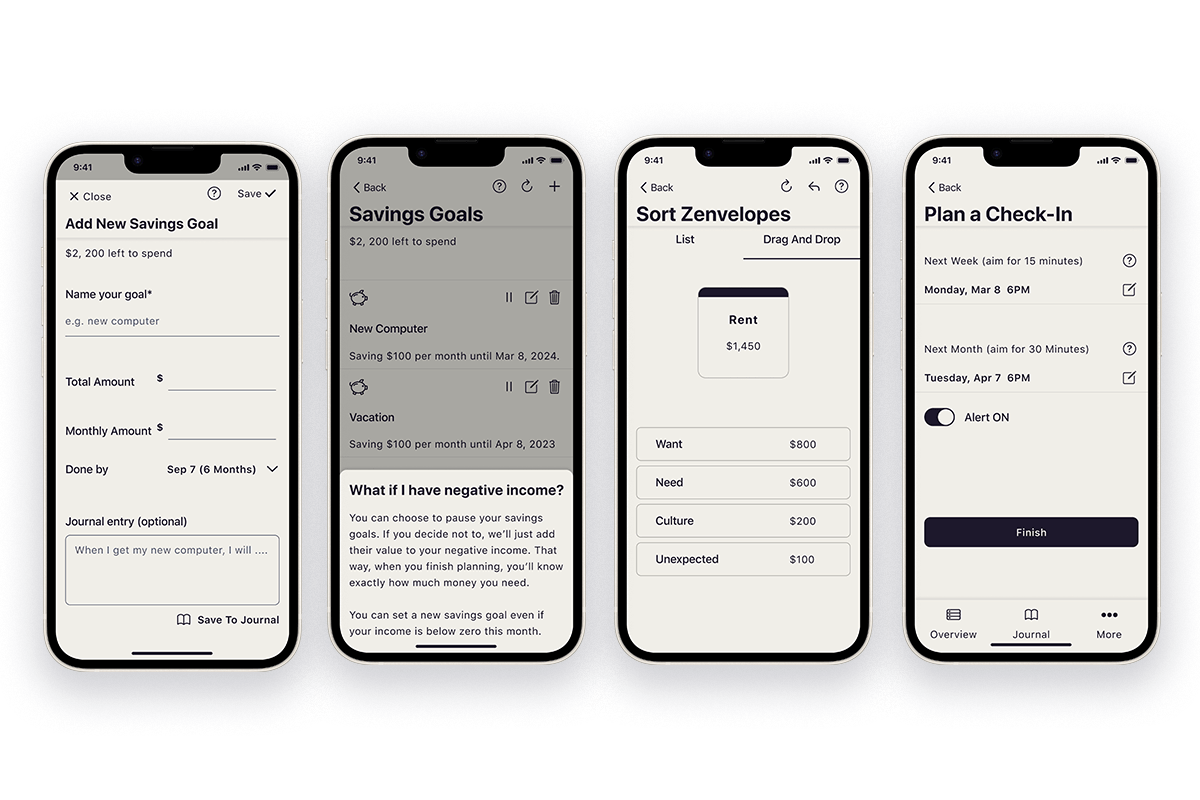
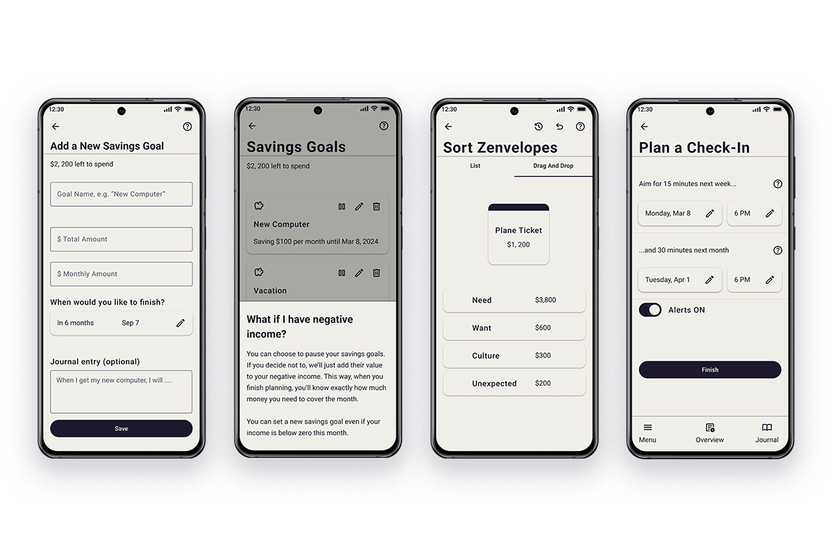
The app's unique approach draws inspiration from a traditional Japanese budgeting system called "Kakeibo." Practicioners reflect on their expenses by distributing them into four categories: needs, wants, culture, and the unexpected. This minimalist and growth-minded approach differs from the Western envelopes model in that it limits the number of categories. This mitigates overwhelm and allows mindful decisions about spending, and over time helps users build healthier relationships with money.
User flow
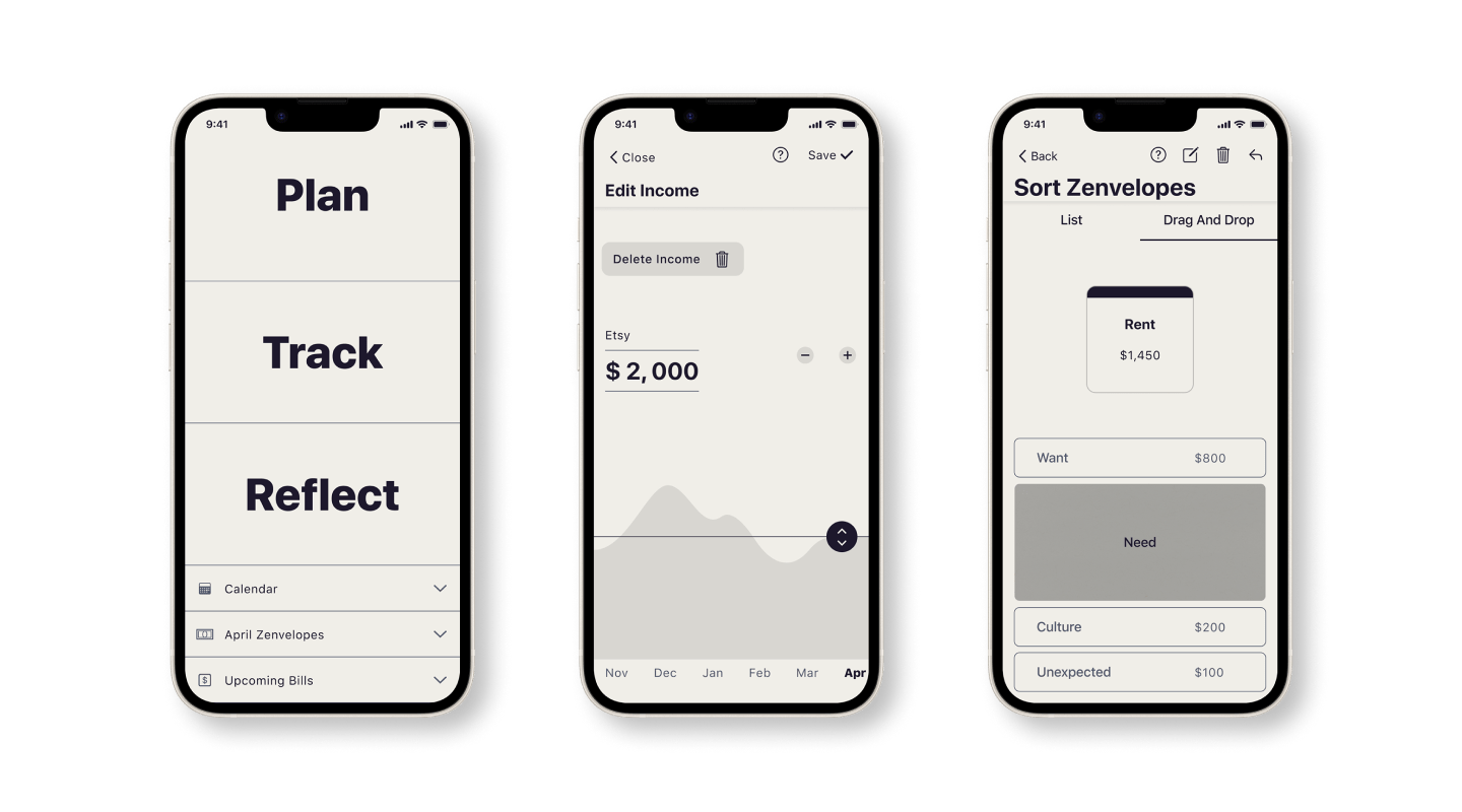
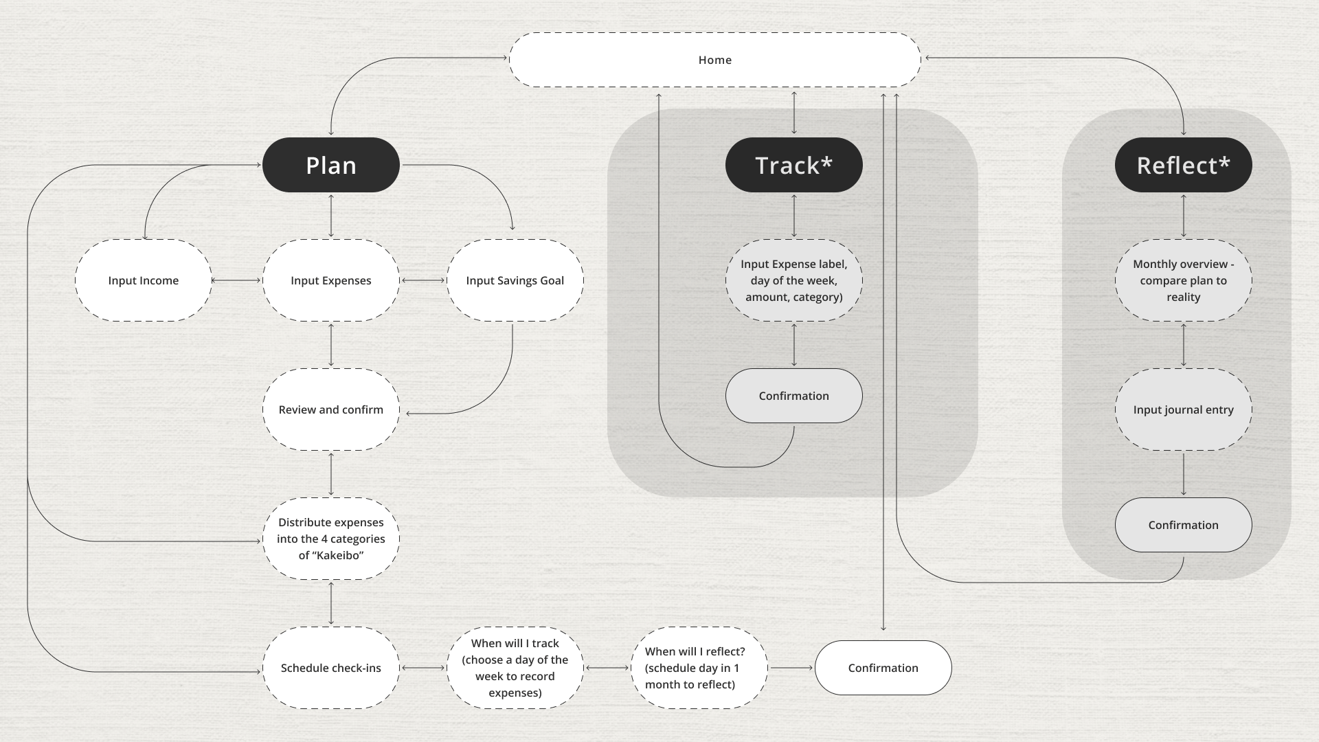
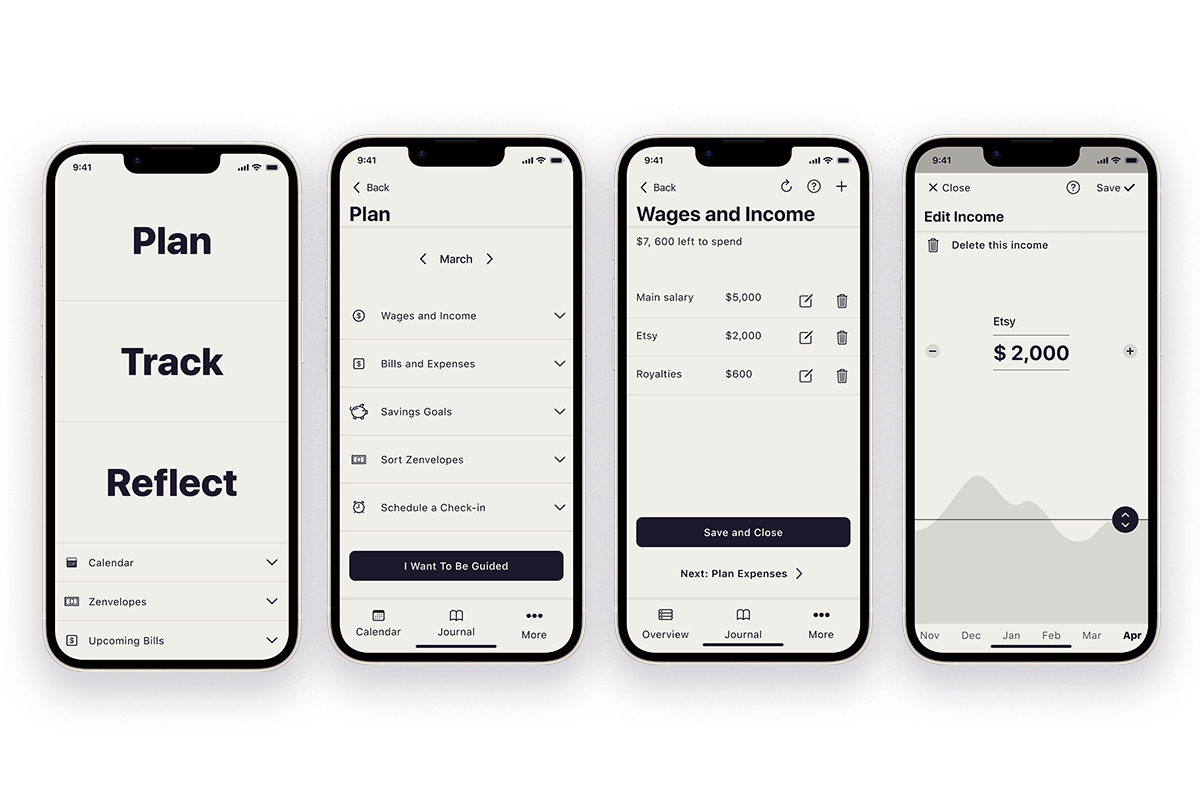
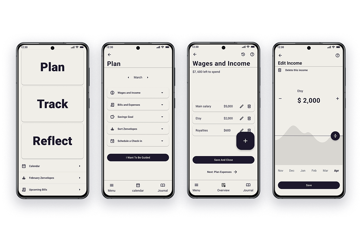
I stuctured the app along three major flows. The Plan flow guides the user through inputting their projected income and expenses, adding an optional savings goal, and scheduling a day to track and reflect. Any flow is accessible at any time from the homepage. Reminders to track and reflect are set by the user themselves.
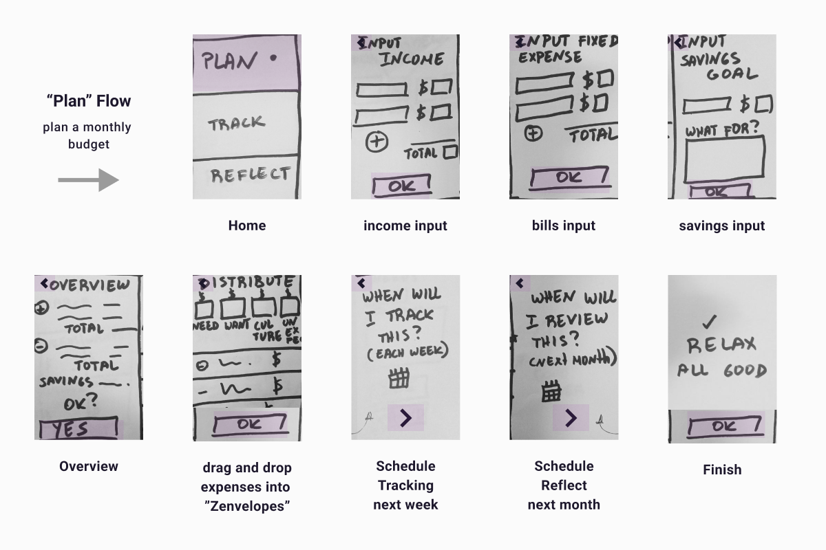
Paper prototype
The objective for the paper prototype was to validate the big picture of the "Plan" flow. I sketched this out using one of my favorite tools, a Sharpie marker. It's so thick that I have to focus on essential elements. This keeps my process focused.
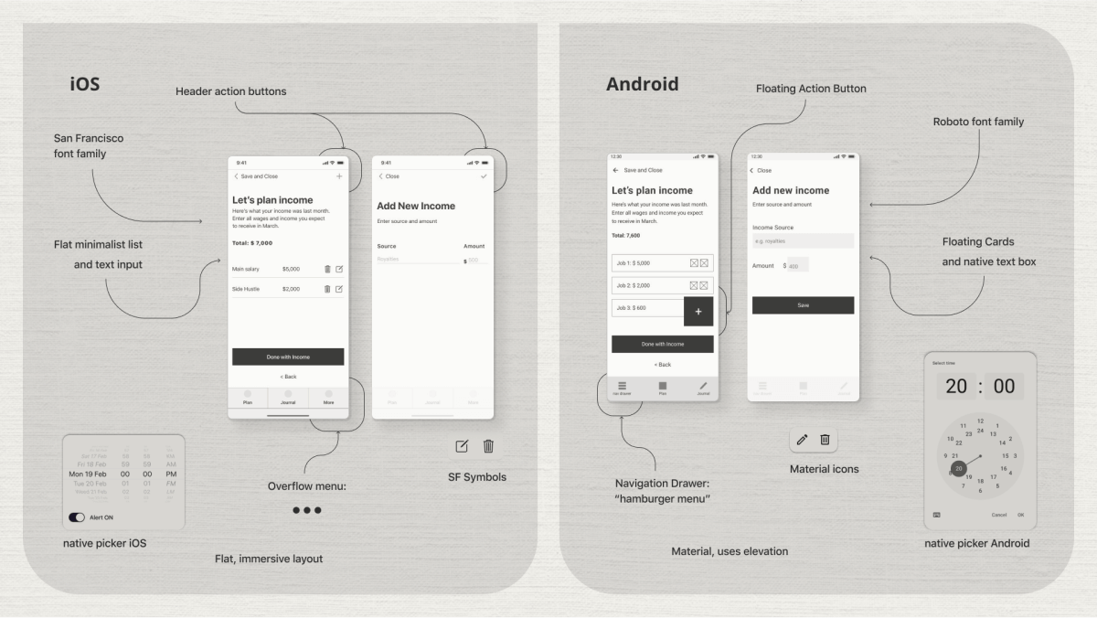
iOS vs Android
I used native features and interactions as much as possible. I made a deep study of Human Interface Design and Material Design guidelines respectively, then worked side-by-side on every screen starting at the mid-fidelity level to create iOS and Android native versions of Zenvelopes. I wanted seamless integration with good security, a smooth native user experience, and an easy time for developers already familiar with native elements.
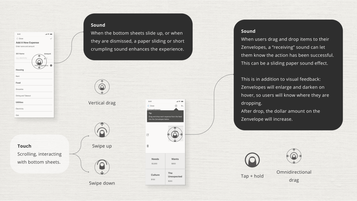
Sound and haptics
I took advantage of native gestures, sound cues, and subtle haptics to ground interactions in the real world and reinforce the native feel of the app. Where appropriate, I implemented a soothing “paper" aural theme consistent with the ink-on-parchment look of the UI.
Test and revise
I built two high-fi prototypes with animated interactions to perform user testing with iOS and Android users. I wanted to assess how easily they can plan a budget, how confident they feel throughout the flow, and to what extent they find the interactions to be natural and familiar.
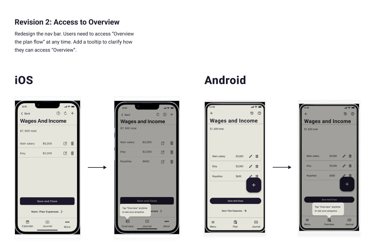
Revisions included an improved navigation pannel allowing users to access an Overview of the process at any time. Users appreciated seeing explanatory tooltip modals throughout the flow, so I kept those. Feedback I did not implement included a suggestion to add more colors and images.
Deliver
Brand
In keeping with a Zen theme, the overall visual direction for Zenvelopes is minimalist and emphasizes typographic hierarchy. It's effectively monochromatic. Textures of handmade paper, parchment or sand are applied to some screens; this reinforces a feeling of mindfulness and calm.
The logo is a minimal set of two ink strokes creating an “equal” sign. They signify balance and reference calligraphy. They also suggest the letter “Z”.
High-fidelity mockups
Next Steps
-
1. Discuss product strategy and potential business
model
The app's business model could involve a freemium approach, offering basic features for free while charging for advanced features such as custom reporting or expert financial advice. Additionally, partnerships with financial institutions for integrated services could provide revenue streams while offering partners the opportunity to appeal to a growing audience of young creators and freelancers.
-
2. Develop an MVP
Design the 'Track' and 'Reflect' flows, a secure user registration and login, as well as an onboarding process to introduce users to the Kakeibo system and how to get the most of the app's features. Finally, plan a strategic MVP launch to gather user feedback for further refinements.
Key learnings
-
1. Native app design
To ensure an intuitive user experience, I had to strike a balance between creativity and adhering to platform conventions. I came away with deep knowledge of iOS and Android design guidelines. I also learned how constraints can boost creativity and drive innovation.
-
2. Cultural insights
The Kakeibo-inspired mindfulness integration met with a positive response from users during testing. This showed me that cross-cultural insights can offer unique solutions that work.