Portfolio website

Project overview
This project aimed to create an impactful portfolio site that would showcase my product design skills while maintaining a unique personality. The primary challenge was organizing diverse projects effectively for design professionals and hiring managers. The result was a polished, responsive website that seamlessly navigates users through my work and highlights my proficiency as both a designer and front-end developer.
Goals
-
1. Design and develop a portfolio site to showcase my skills in product design and reflect my personal style.
-
2. Cater to design professionals and recruiters, presenting a range of projects in a clear, effective, and scannable way.
Constraints
My role
UX designer and front-end developerTimeframe
7 weeks design and developmentTools
Pencil, Figma, VS Code, GitHubLanguage
HTML, CSS, and JavaScriptDesign process
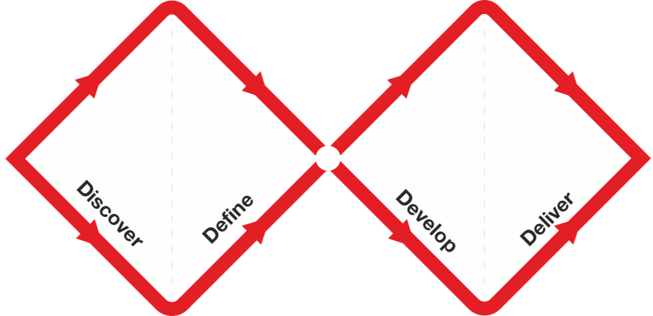
I used a double diamond framework for this process, which is characterized by alternating periods of gathering input to create possibilities (opening up) and narrowing them down by making decisions to eliminate ineffective solutions (closing in). This gives rise to four alternating phases: Discover, Define, Develop, Deliver.
Discover
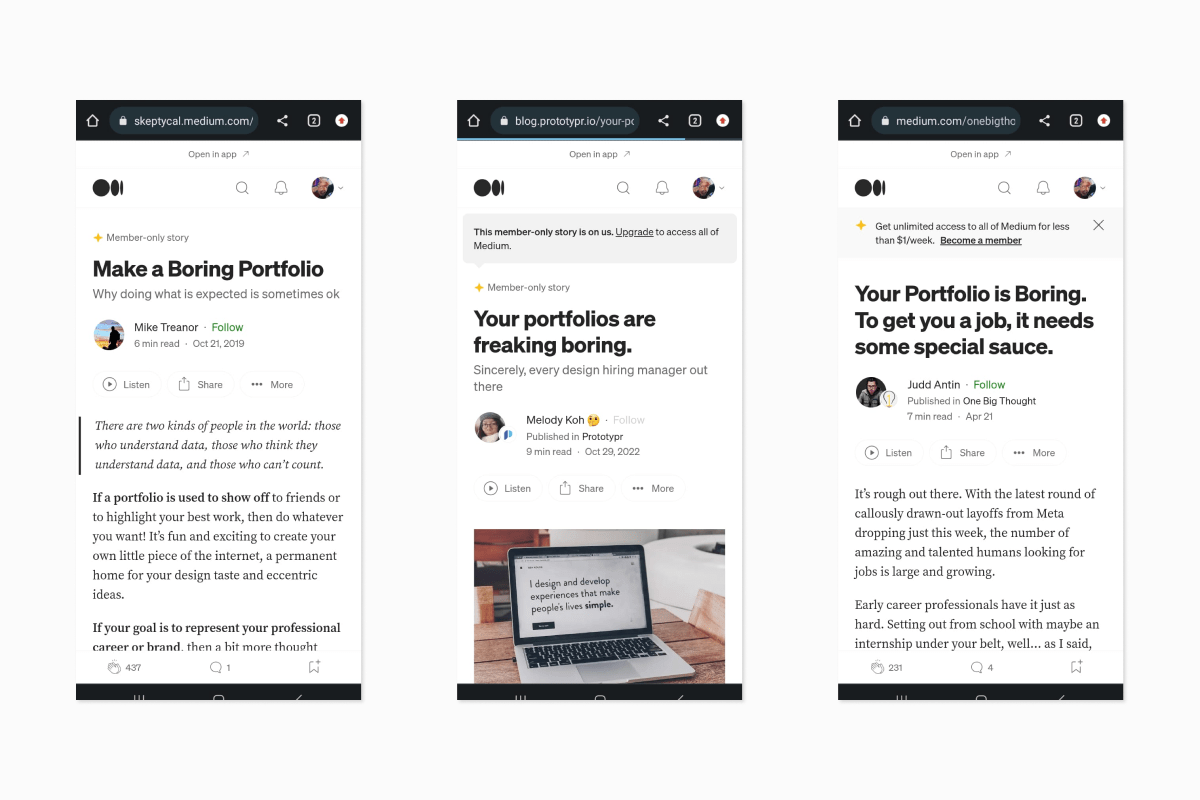
In the initial stage, I delved into understanding my own goals and user expectations. I analyzed the preferences of design professionals and hiring managers using primary and secondary research on available platforms like LinkedIn, Medium, Behance. I identified the need to emphasize both my skills and unique identity while telling a story and ensuring content is concise and scannable.
Define
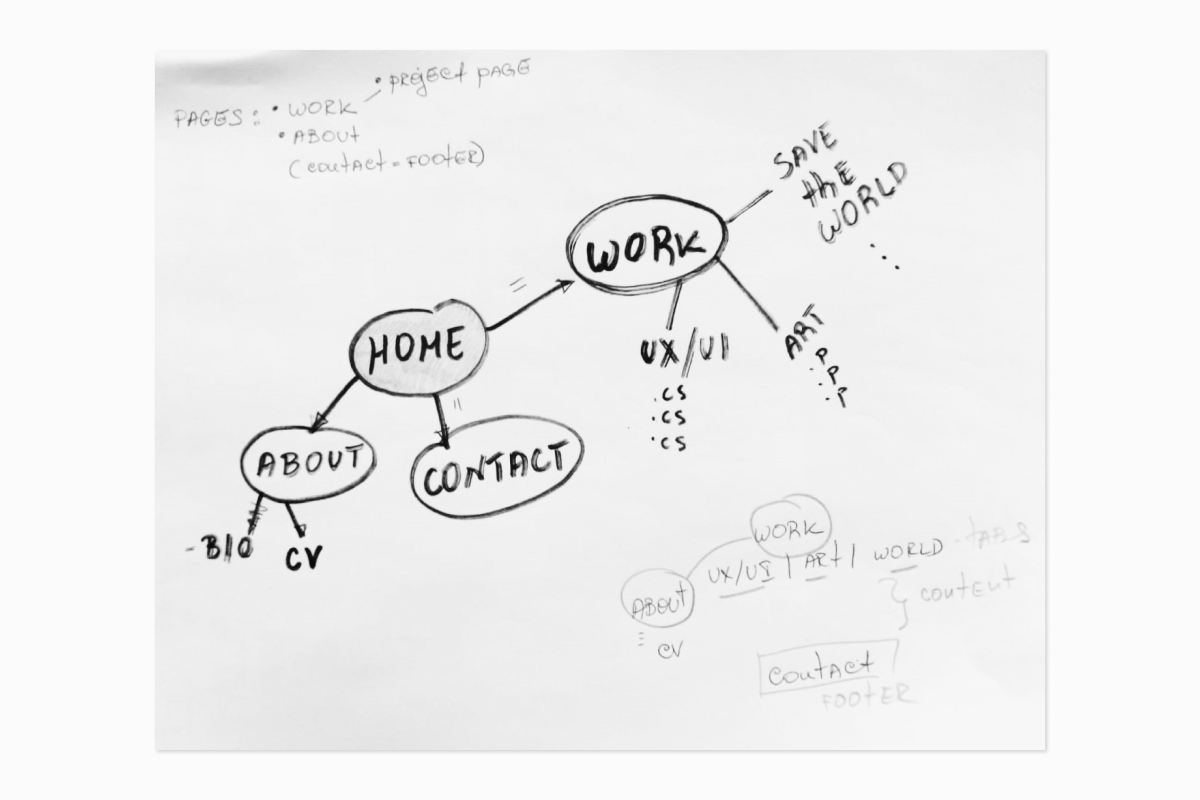
With a clearer vision, I defined the site's structure and content. I established major sections for Work, Contact, and an About section. Within the Work section I would define space for UX/UI projects, conceptual art work, and my textile design initiative. This phase allowed me to outline the user journey and tailor the design accordingly.
Develop
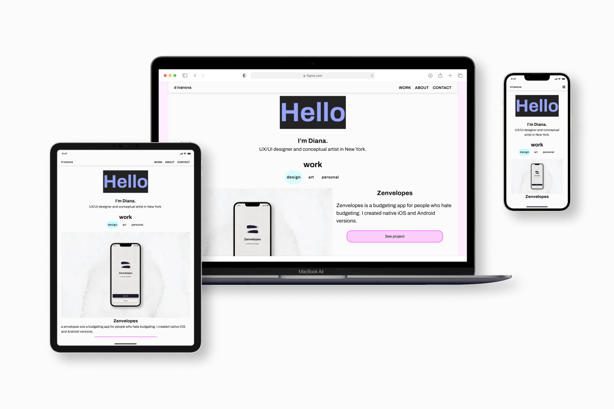
I embraced a mobile-first approach from the outset. I accounted for 4 breakpoints: min-width 320px, 640px, 1024px, and 1200px. This allowed me to create a smooth experience across various devices. When the Home page was laid out with navigation and basic mockups of the About page and 1 Project page, I conducted usability testing.
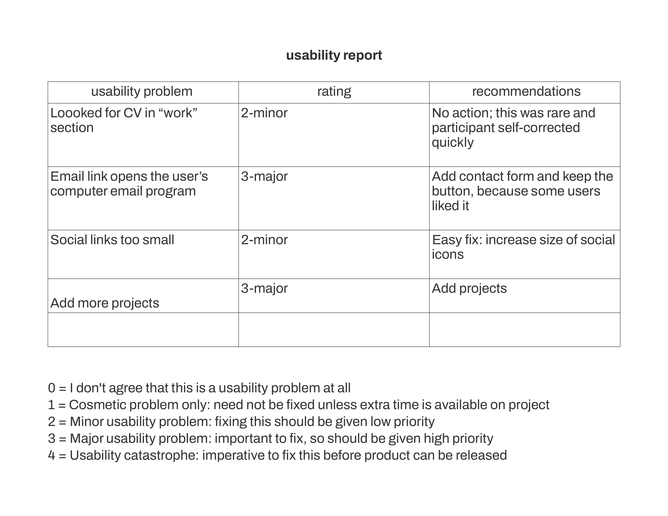
User Testing and Iteration
I recruited 5 participants and ran tests face to face on a variety of devices. Participants were given a starting situation and a number of tasks to complete, followed by two or three open-ended questions. Incorporating key feedback from testing, I refined the design in a second iteration, enhancing the clarity and visual appeal of the site.
Interactivity
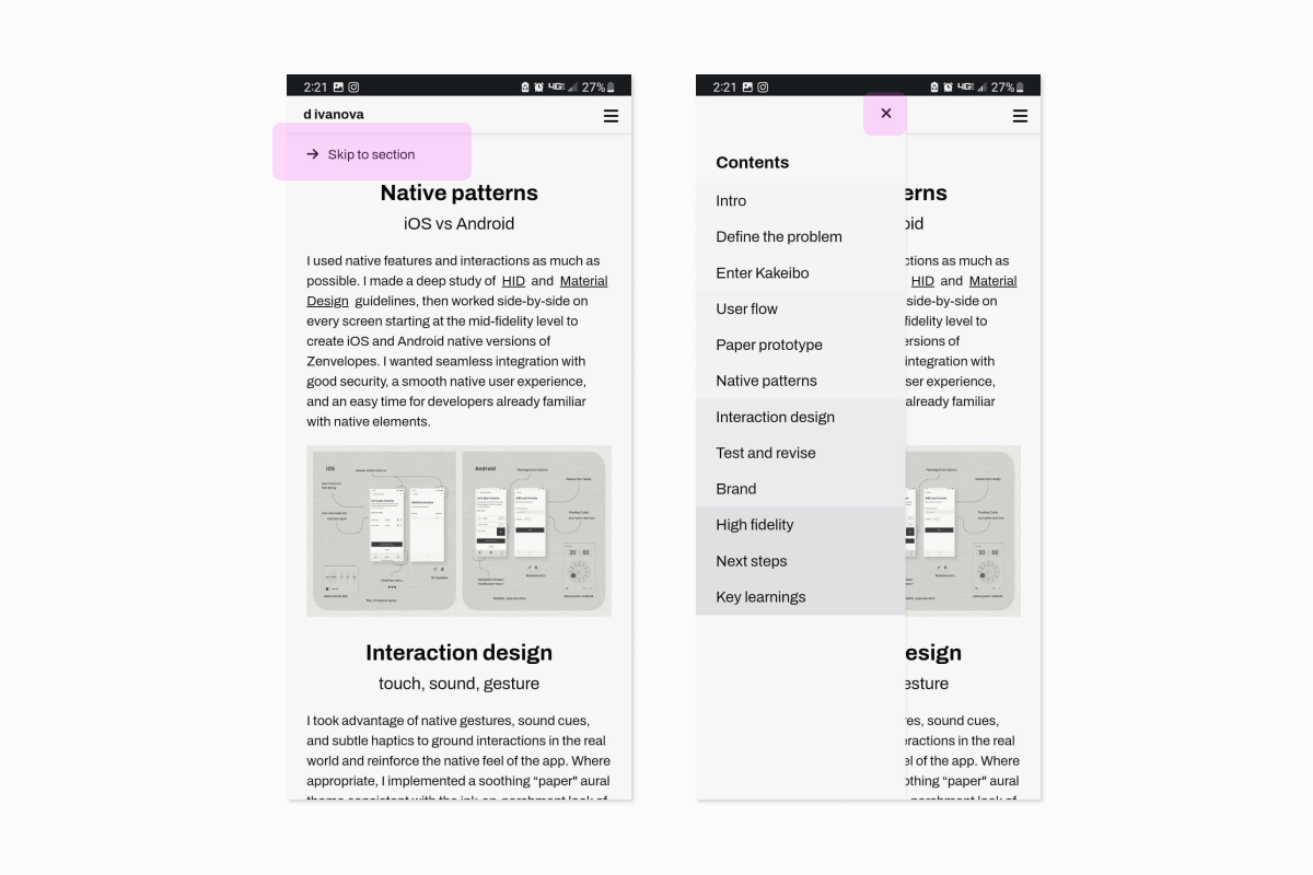
I used JavaScript to add interactivity notably enhancing navigation. At the XS breakpoint, the nav bar collapses into a hamburger menu to conserve whitespace and good readability of the links. Smooth scrolling guides users to the footer, which is where my contact information is found. To enhance navigation within case studies, I introduced a slide-out drawer menu with a table of contents. This lets users skip to different sections, providing flexibility in exploring case study content.
Deliver
I launched the website so I could give it a try in a variety of contexts and collect more feedback. It effectively showcased my UX/UI projects and gave an idea of my additional interests. It aligned with the project goals and target audience preferences.
Code validation, cross-browser testing and accessibility
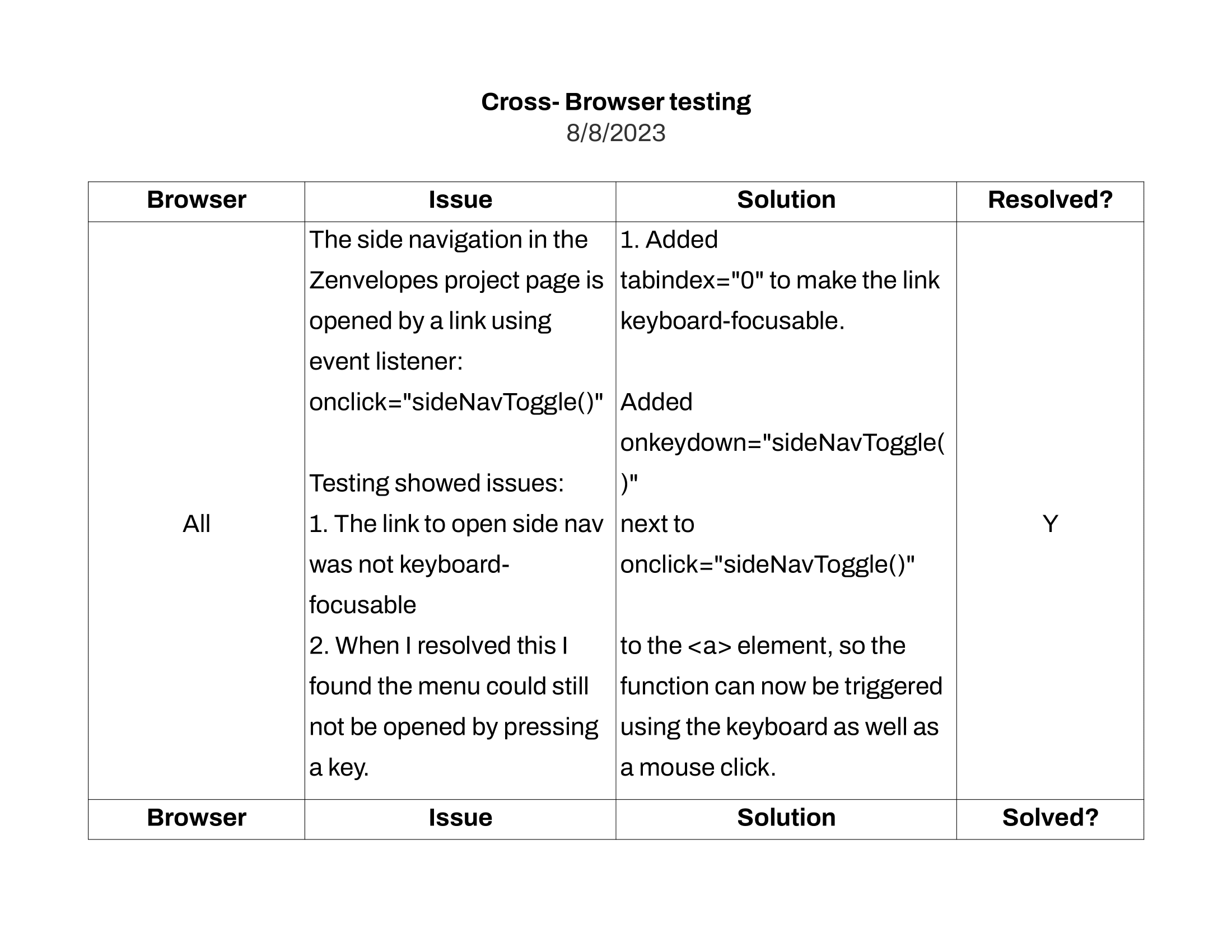
During this phase I thoroughly assessed the validity of my code using VS Code plugins and online validators. I conducted comprehensive cross-browser testing, examining the website's behavior and appearance on various platforms and browsers. I enhanced the keyboard accessibility of the side navigation drawer and ensure that focus outlines were consistent and accessible where needed. Finally, I evaluated color contrasts to ensure adherence to WCAG AA and AAA standards, prioritizing accessibility and readability for all users.
Challenges, learnings and next steps
Challenges and solutions
-
1. Learning Front-End Development
I overcame the challenge of acquiring front-end development skills in a short span by immersing myself in the project, making the most of my mentor’s time, and looking for skills beyond my course content. I was able to rapidly build proficiency.
-
2. Balancing Professionalism and Identity
By integrating playful accent colors like hot pink and pale blue with a black and white palette and lots of whitespace, I achieved an appropriate blend of professionalism and personal expression.
-
3. Visual Unification of diverse projects
My solution involved crafting consistent cover images for each project. They all feature a mobile device, tablet, or fabric swatch on a consistent background. This creates a cohesive visual experience across diverse project styles.
Key Learnings
-
1. Rapid Skill Acquisition
For this project I was short on time but had plenty of resources. By maximizing what I do have ‐ a hands-on project to immerse myself into, time with a knowledgeable mentor, and vast information online ‐ I can rapidly acquire what I need.
-
2. Visual harmony
Successfully merging playful design elements with a professional tone taught me the importance of visual harmony. In this case visual unity through cosistent cover images and logical organization of material in tab groups present a clear and digestible picture.
-
3. User-Centric Enhancements
By incorporating interactive elements based on user feedback, I realized the value of continually refining user experiences for better engagement. I saw first-hand how JavaScript interactivity can foster a smoother experience.
Next Steps
-
1. Images
Implement a shadowbox effect for enlarged image viewing and galleries.
-
2. Content
Add case study pages for remaining projects. Populate the "more information" sections of art projects.
-
3. Loading time
4. Assess and improve loading time factors to ensure optimal experience across devices and connection speeds.
-
3. Test and iterate
Seek out feedback and testing to validate new changes. Conduct accessibility audit of new changes.