Zenvelopes "We want to build a budgeting app" is the shortest design brief ever. Read on to see how I gathered requirements and what I delivered, or stay for the spoilers: I started by talking to devs about what they want (and don't want) to build. Then I assessed the market viability of "not your dad's budgeting app". I asked real budgeters what their hopes and nightmares were. Then I applied these 3 perspectives (devs, market, users) to design a unique and wonderful product from 0 to 1.
Try a prototype. They open in Figma.
My role: Product Designer
Timeframe: 6 weeks
Tools: Spreadsheets, Markers, Figma
Defining technical constraints
Faced with a very broad task, the first thing I did was narrow it down by making a list of tehnical constraints. Here are some questions I asked: How will this be built? What problems do you expect? What would make your life easy? What would make your life hard? What technical limitations do I need to respect? This gave a start to a list of requirements:
native
lightweight
different
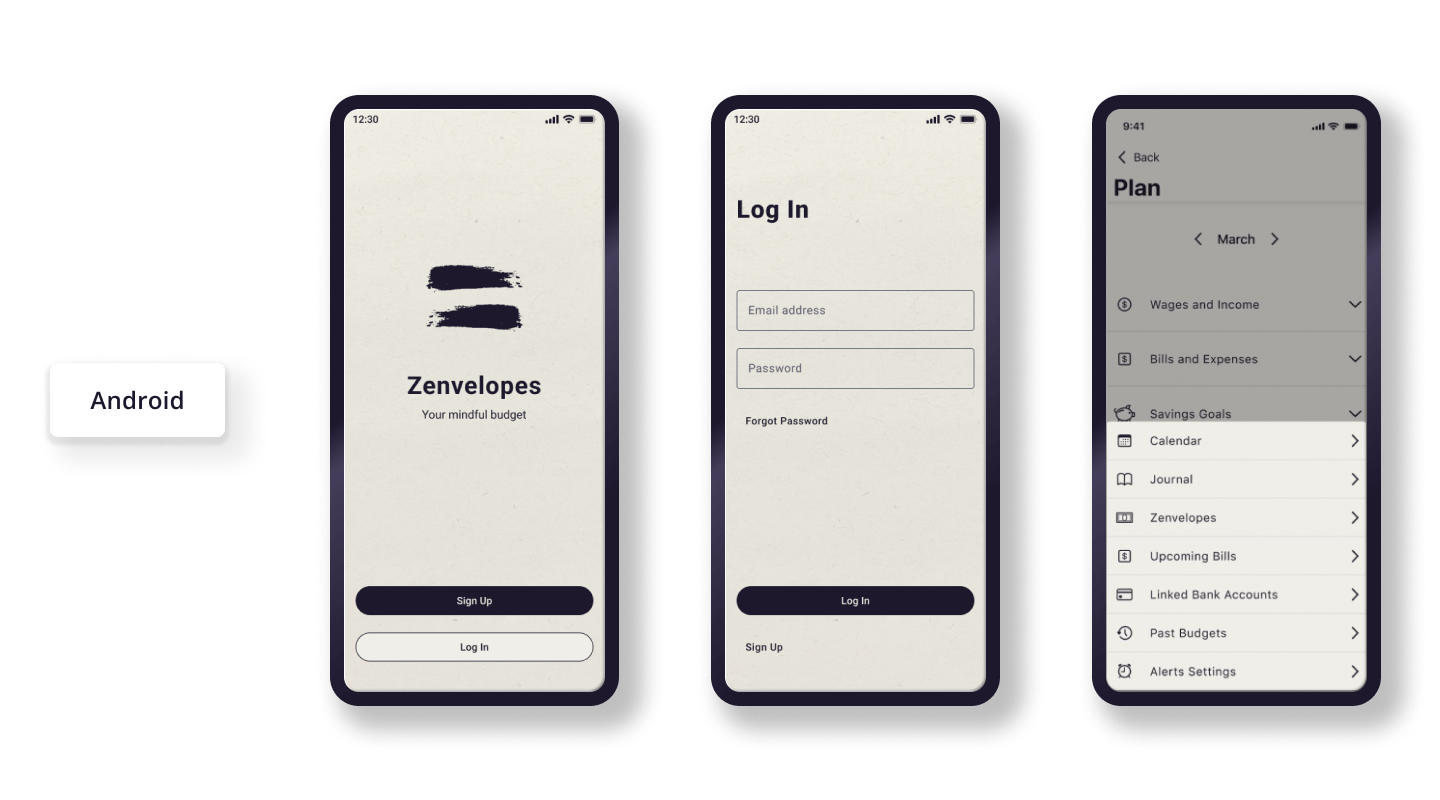
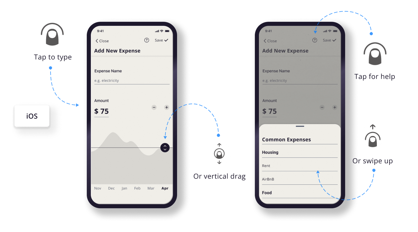
Native design
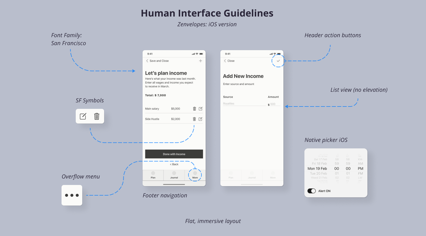
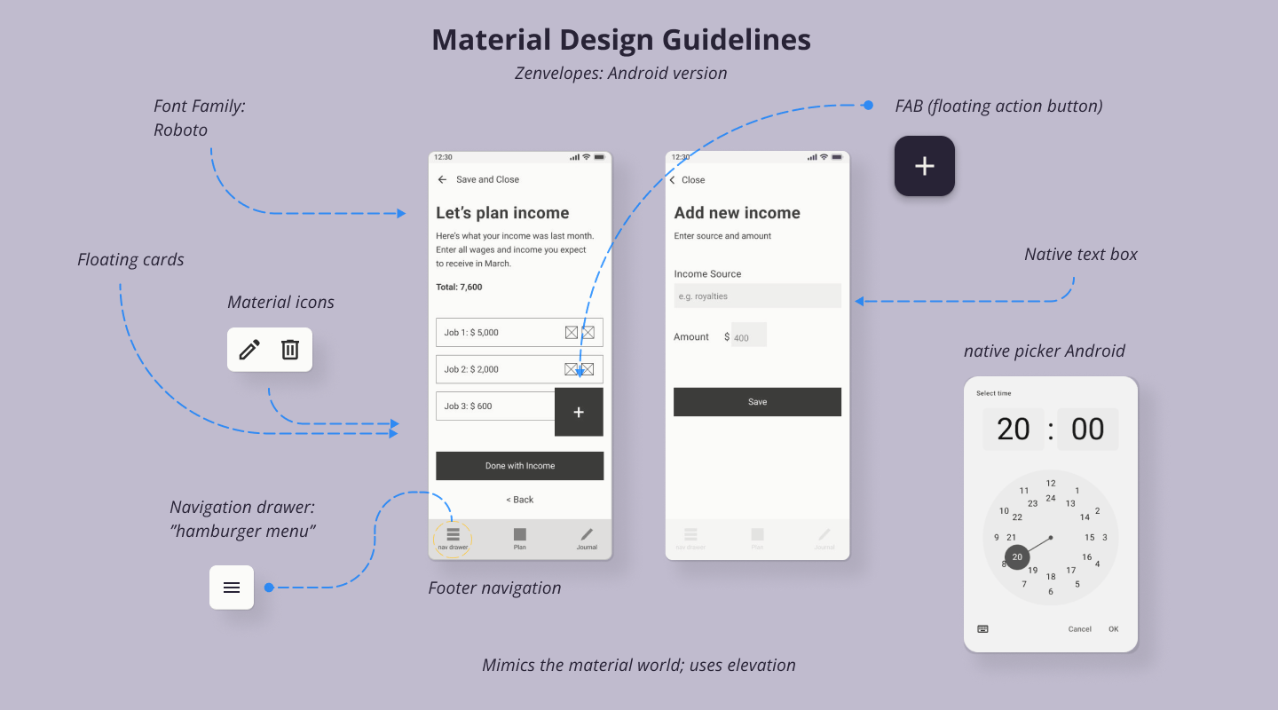
A smooth and secure native experience: from the mid-fidelity stage onward, I made a deep study of Human Interface and Material Design guidelines.
Minimalist visuals
Minimalist visual design with good contrast and clear hierarchy: for a lighter and more accessible product, the bells and whistles are invisible.
The logo references balance, calligraphy, and the letter "Z". I used a brushstroke asset by Freepik.
Intuitive interactions
Interactions are familiar and easy. Adherence to native platform design guidelines ensures interaction patterns are optimized.
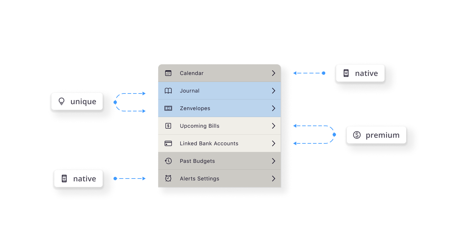
Monetization
-
Freemium model
Core features are free while advanced features like custom reporting, expert financial advice, and some automations are available as a paid tier.
-
Partnerships with financial institutions
Partnerships for integrated services could provide revenue streams while offering partners the opportunity to offer a unique experience and secure a growing audience of (more on the target audience later).
-
Additional services
The brand identity is uniquely scalable, able to grow to offer coaching and other financial services for (more about them later).
Something for everyone
The feature breakdown has something for everyone: new budgeters can enjoy core features to calm anxiety and build self-awareness. More confident budgeters can join a Premium tier to access powerful automations, financial advice and more.
But why build another budgeting app?
Time to talk about the elephant in the room: why buid yet another budgeting app? To find out, I set out to understand what offerings exist on the market. I assessed potential opportunities for a new product by casting a wide net, then zeroing in on Mint, RocketMoney, and Ally Bank’s “Spending Buckets” feature for a deeper look.
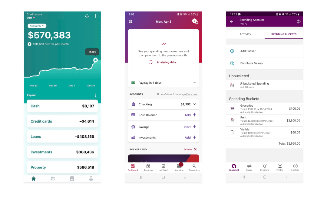
What are competitors doing right?
Dynamic data visualizations help users see their status.
Automatic income and expense tracking is convenient.
Data ‐driven insights are informative.
Show me the bad reviews.
Too many features can be confusing.
Steep learning curves can be discouraging.
Too much information can be overwhelming.
What are they missing?
Competitors failed to support people with multiple income streams, no income, or negative income.
They relied on gamification and aggressive alerts, which can increase financial anxiety.
They offered excessive automation features, which can increase feelings of control loss.
Talking to budgeters
By this time, I had used four apps to plan my September budget, read about eight more, and watched about 4 hours’ worth of in-depth video reviews. As I tallied pros and cons, a picture started to form. I began to suspect that someone might be slipping through the cracks.
Theme 1: "Budgeting apps think I live in the 50’s."
Traditional budgeting advice tells budgeters to put down their monthy income. That is harder than ever to do. 1/3 of America is freelancing today, but in just 3 years that figure will go over 1/2! The workforce is changing: makers, nomads, side-hustlers, gig workers, creators and students can have multiple streams of unpredictable and sometimes negative income. Edge cases are quickly becoming the norm. So I had to take notice when interview subjects said:
"I needed another app just to calculate what to put into this app. Why do I need two apps?"
Sources: Freelancers Union, Statista, Google Trends.
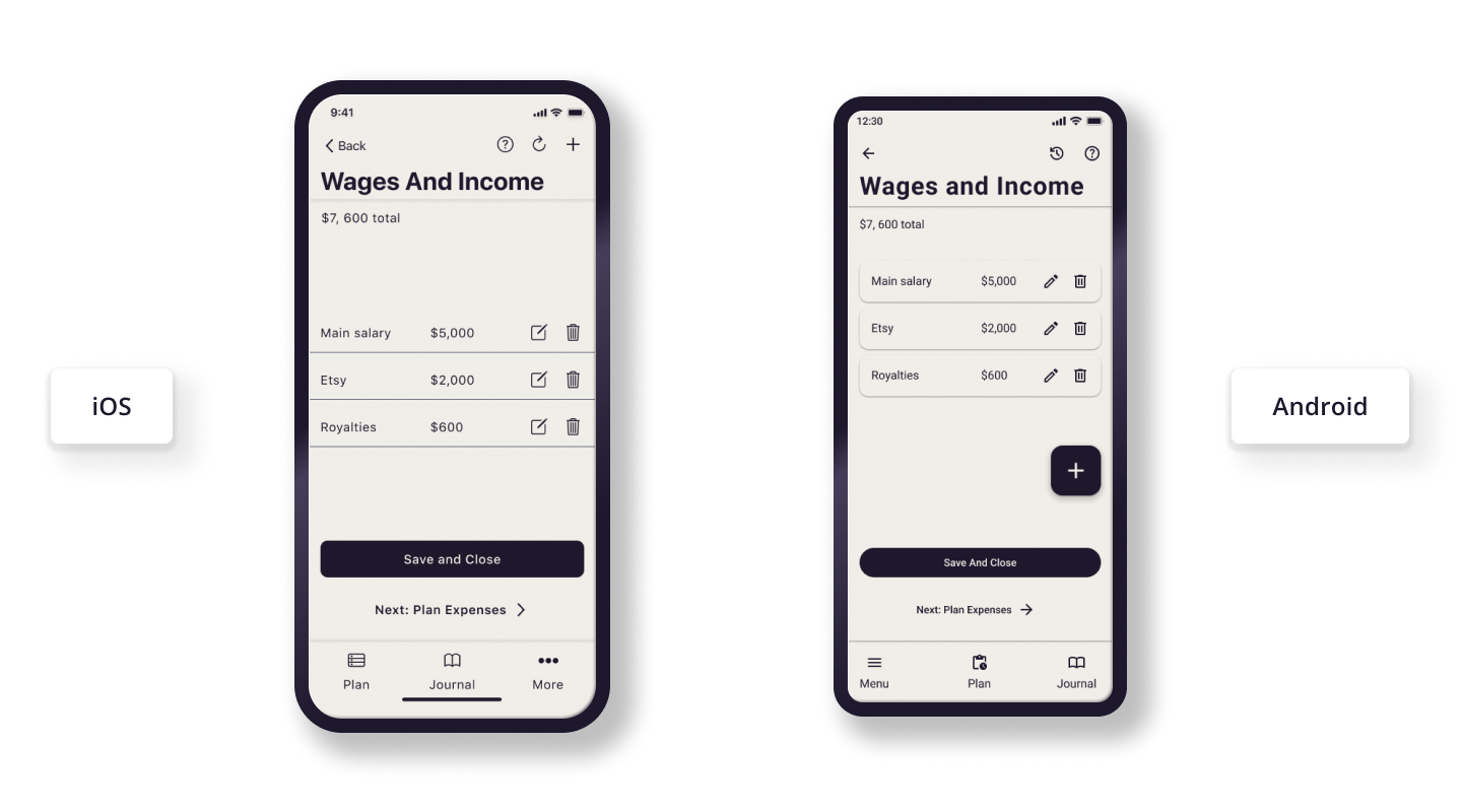
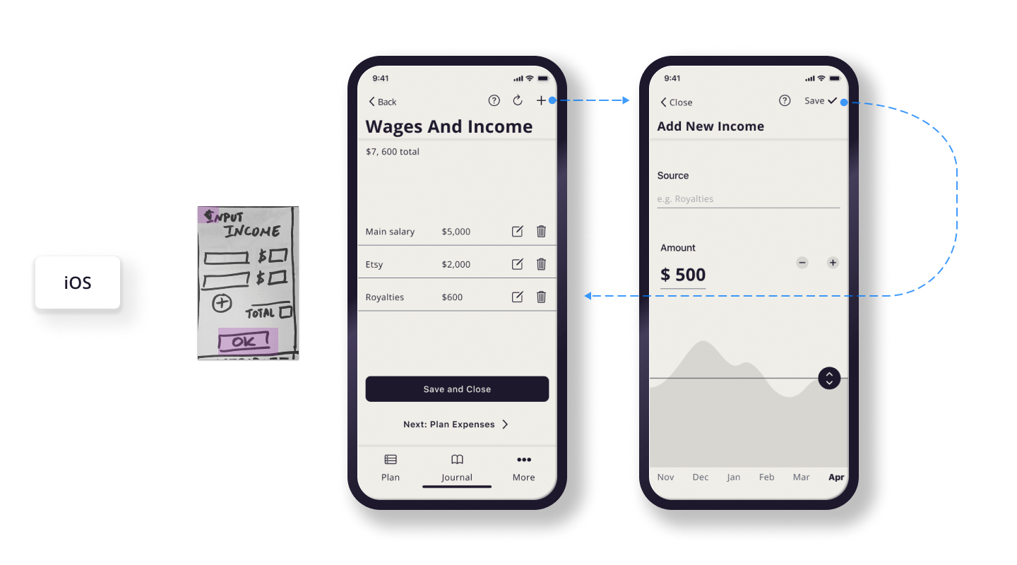
Multiple income streams are a matter of course.
Load up your list of steadies, and select the ones you expect this month. Slow period? You can skip this step and move on to expenses. Zenvelopes allows you to count negative income with no judgment ever.
Theme 2: "Budgeting apps are intimidating."
"Why does this look like the Matrix?," offered one interview participant. "If I was a math genius I wouldn’t need this app in the first place."
Research shows that some level of math anxiety affects up to 93% of US adults. By failing to address this, budgeting apps are failing a huge swath of the population.
Bias warning: a popular fallacy states "creative people are not math people" because of "the left and right side of the brain." This is a false concept that emerged during interviews. Creative hobbyists and professionals shared they felt intimidated by charts, graphs, and spreadsheets.
Creatives are far more likely to freelance, engage in gig work, or have a side hustle like selling handmade items. 55% of Entertainment workers freelance, while in Arts and Design the figure jumps to 75%. This means that people affected by the false right brain/left brain dichotomy are also more likely to have complex income models.
Sources: The New York Times, Luttenberger et al, Zippia
Addressing math anxiety
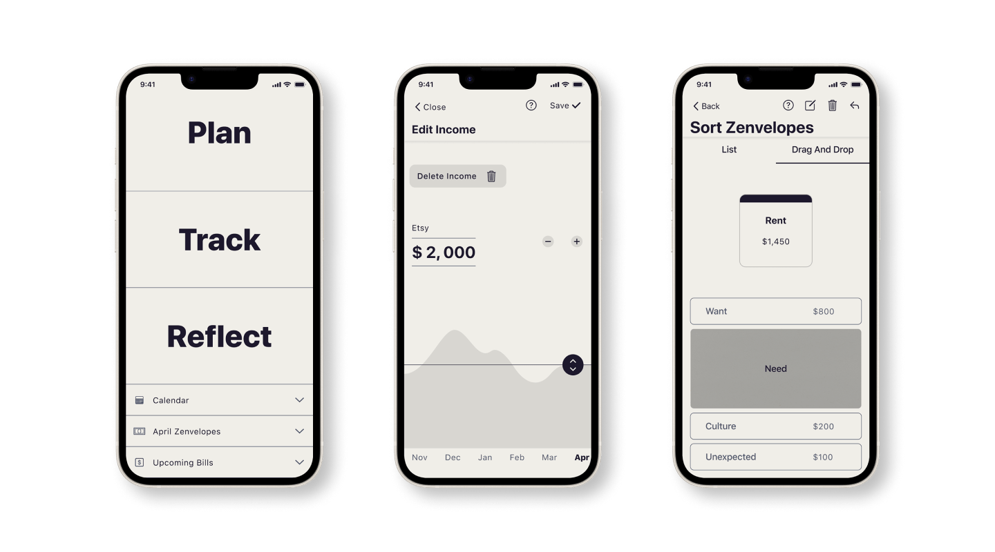
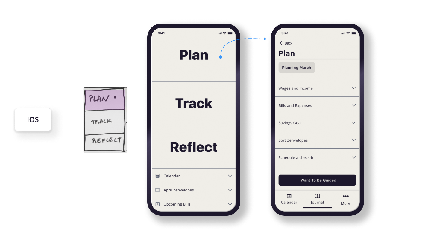
Plan, Track, Reflect. Choose to be guided, or make your own path. Zenvelopes uses a storytelling approach to break down the budgeting process into understandable steps. The whole path can be overviewed at any time, so there are never any surprises.
Theme 3: "Budgeting apps don’t help me grow."
Interview participants shared a desire to understand spending and money management and improve their habits. Those who tried a budgeting app and deleted it, did so because it failed to provide lasting change. Every notification was an unwanted reminder that they are failing to stay within budget.
"I felt like Pavlov's dog," signed one interview participant."I don’t want to just connect my bank and get a bunch of stats - I want to do better."
Helping budgeters grow
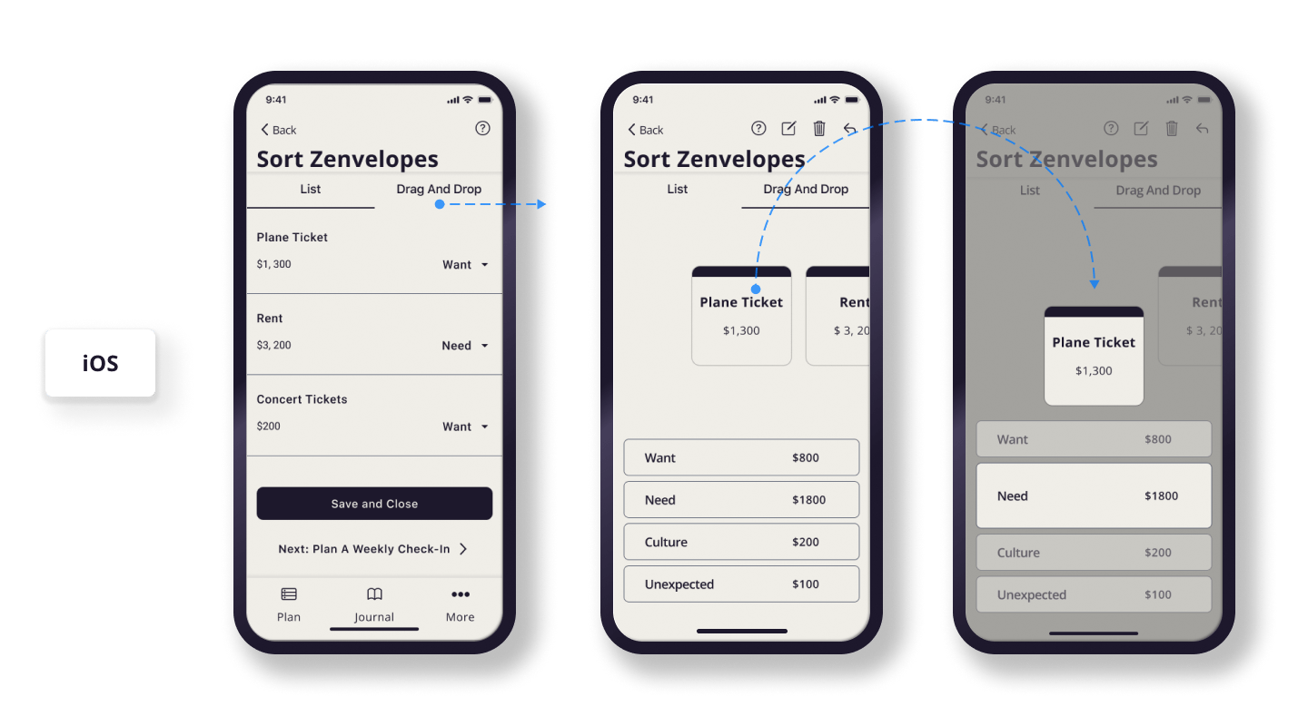
Build self-awareness by assigning each expense to a mindful category: Needs, Wants, Culture, or the Unexpected. This feature is inspired by the medieval Japanese practice of Kakeibo. Fewer categories means less stress, and sorting Zenvelopes each month is a meditative reminder of what your spending means to you.
Giving budgeters control over alerts
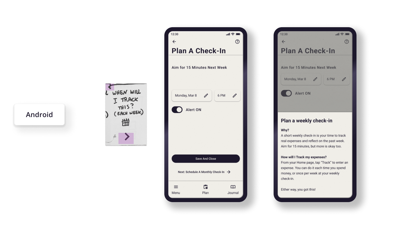
Grow accountability by planning your own time to check in: no automations, and no alarms unless you set one. It's like scheduling a date with your future self.
Key learnings
-
Native app design.
I had to strike a balance between creativity and adhering to platform conventions. I came away with deep knowledge of iOS and Android design guidelines. I also learned how constraints can boost creativity and drive innovation.
-
Defining constraints.
Faced with an exceptionally open-ended task, I had to identify constraints on my own. I learned the value of seeking out input, and of thinking critically about the big picture of product strategy from day 0.
Read Next
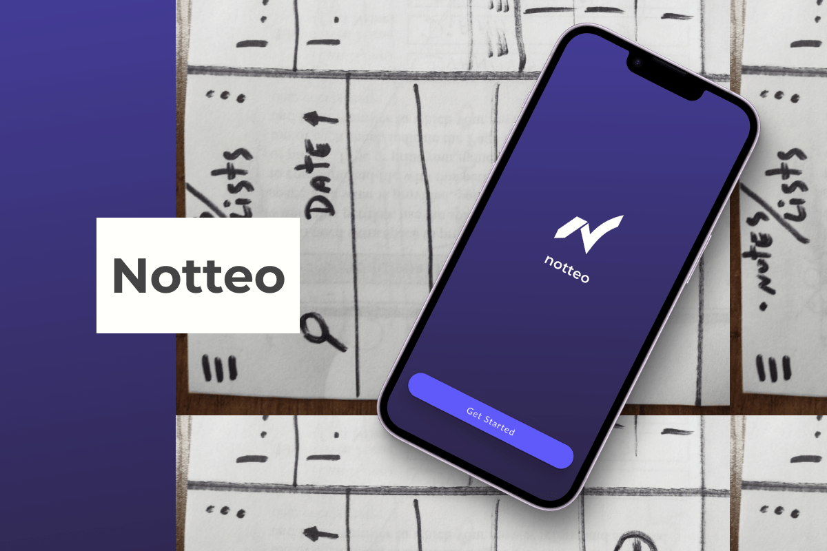
Notteo
Designing minimalist UI and branding for a note-taking app, in 4 hours.
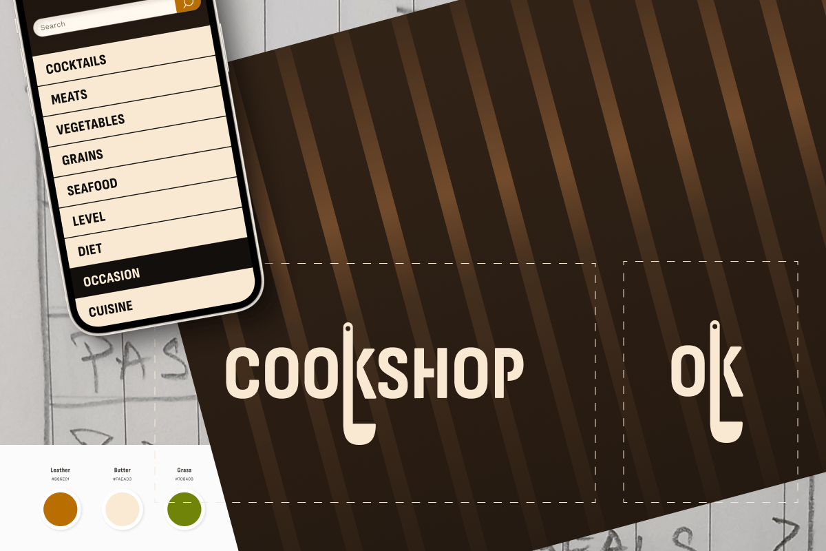
Cookshop
Exploring whether male-identifying home cooks suffer gender bias in recipe content. Defining which visual cues “masculinize” UI.
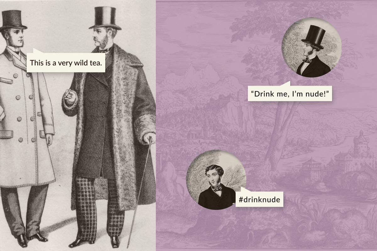
Wild Bloom
Developing a brand to "decolonize the tea trade". Then, building a functional responsive online store for an ethics-driven luxury tea company.